Friday, 21 September 2012

Floral Friday: Jane Bridges

This weeks Floral Friday is the wonderful Jane Bridges. Her florals are absolutely beautiful, using superb bright colours and a fantastic mix of inspiring illustrations. Her label, Patternhouse, is based at Jane's own garden studio in Yorkshire, which I can assure you is one of the most beautiful places in Britain, and therefore brings me no surprise that Jane has produced some really gorgeous floral designs. Jane can also pride herself on the fact that all her products are printed and made in Britain, something I find very rare and extremely admirable in this day and age!

Jane talks to us about her work:

"I am based near Ilkley, West Yorkshire, where I design for my own label Patternhouse and also for freelance collections for both fashion and home. The essence of my work is very much art-based – a fresh, painterly style. My inky, colourful hand paintings and sketchy drawings are translated into lively, contemporary designs. The traditional much-loved subject of florals is brought bang up to date. I never tire of flowers - the variety is endless. I love visiting gardens for inspiration all year round. I have received national and international recognition for my work. In 2011 I was a winner of the Surtex Designext Competition in New York and in 2012 I was a finalist of  the Wallpaper of the Year competition. In the future, I hope to expand the range of products which feature my designs - I am currently working on a new wall art collection, fashion prints, cushions and tableware, so quite a range!"

To see more of Jane or to purchase any of her great designs, visit her website here. Follow her on twitter here. Like her on facebook here. Or contact her on jane@patternhouse.co.uk.




Thursday, 20 September 2012

I can't stop listening to...

This week, I have three bands for you to listen to! The reason being is I'm going to a gig tonight where all three of these bands are playing. I know for a fact it's going to be an amazing night, as I really love a lot of the songs I've heard from the bands.

I've picked out a song for each band for you to listen to: Flaws by Bastille, Talk Through The Night by Dog Is Dead and I Just Know by The Struts.


Bastille - Flaws


Talk Through The Night - Dog Is Dead 


I Just Know - The Struts


Tuesday, 18 September 2012

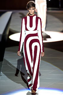
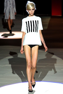
Earn Your Stripes! Marc Jacobs Spring 2013

I'm a huge fan of Marc Jacobs and more often than not I fall in love with his collections. His Spring 2013 collection is reminiscent of the 1960's with bold black and white contrast and resolute separation of colours. Simplicity was key in this collection: a very simple colour scheme of black, white, nude, red and blue. 

Stripes were everywhere: vertical, horizontal, on the collar, on the hem, big stripes, small stripes and optical illusion stripes.

I've chosen some of my favourite looks from the collection, I hope you enjoy them as much as I do!


Monday, 17 September 2012

Traditional Florals: Spring 2013

As I was having a quick look through the Spring 2013 collections I noticed that a few designers had incorporated beautiful traditional florals into their prints. I find this really great to see because, although I adore all kinds of florals, I really do love a great traditional! I've picked out five designers to showcase these wonderful prints; Brood, Calla, Duro Olowu, Peter Som and Thakoon. 

Calla Spring 2013: Gorgeous florals that remind me of Japanese florals and calligraphy. A great juxtaposition between soft pastels against a pale background to bold colour pops against a dark. Beautiful leaf prints in an all blue colour scheme are incredibly elegant.


Brood Spring 2013: Very traditional - almost Cath Kidston with the mix of blues, pinks and whites. A fantastic use of brilliant roses and dark green leaves. I really love the mix of lace for the look too.


Thakoon Spring 2013: Traditional floras with a twist: using birds and butterflies to create a quintessentially english print. The use of line from the top to the bottom of the dress makes it looks as though the dress is a huge bird cage. The dark background in the second image down remind me of old renaissance paintings. The third image down is a little different, with an orange repeat print of what looks like a poppy. Beautiful illustration made me fall in love with this one.


Peter Som Spring 2013: This collection is probably the least traditional of the prints I picked out, but they reminded me so much of a Spring country garden with the gorgeous soft colours mixed with bolds. The shapes of the floral prints look a little bit like a lavender flower. 


Duro Olowu Spring 2013: Traditional with a twist. Not entirely created from florals, these prints hold beautiful sketches of old-fashioned women in garden situations looking to be having a gleeful time. The use of the situation sketches remind me a lot of Timourous Beasties work and doiles. A sweet little poppy print livens the collection up with a pop of red. 


Sunday, 16 September 2012

Sunday Special: S is for... Shadows!

The Shadows were once one of the most influential bands of their time. Frequently referred to as 'The Shads', they had many charted singles, both with and without Cliff Richard. 

George Harrison from The Beatles once said "without Shadows there would be no Beatles" and John Lennon has been known to have said "before Cliff and The Shadows, there had been nothing worth listening to in British music".

I've only just really started listening to The Shadows a lot, but I'm hooked. As a huge Beatles fan, I find it really easy to see where the influences have come from and can totally appreciate the great music that The Shadows made. 

I'm a huge sucker for music from the Fifties, Sixties and Seventies and always will be. I feel that almost every musician from around that time had true talent. There wasn't the auto-tuned, electronic sound to it like the music we have today does, it always sounds so true and fresh and you can hear the pure talent.
If I could go back and visit any time in history, it would be a time from those three decades without a shadow of a doubt, not only for the amazing music but for the great fashion too!

Here's a Shadows track, probably one of the most well-known instrumentals the band ever did. It's also currently on a sausage advert here in the UK.


Saturday, 15 September 2012

Now I Know My ABC...

Sounds like a silly thing to say, but letters are huge at the moment! With designers such as Mary Katrantzou, Versace and Stella McCartney all using letters in their collections, learning you ABC's has never been cooler.

In Vogue's September Issue, a small feature named 'Spotlight On Alphabet Street' really caught my eye, showing me many different companies that have recently used letters in their products: A wall hanging by Paul Smith for The Rug Company, a cute notebook set by Cavallini & Co for Libertys, an Alpha Chest by Graham and Green and a lampshade by Judy Holme.


Not long before I bought this issue of Vogue, I actually bought myself a rubber stamp set off Ebay, so I was pleased to see an article like this! I've not really done much with my set yet, other than play around a little and use it for little 'Thank you' notes to friends and family.


It's great to see that such a trend has become powerful in both the Fashion and Interiors world.


Graham & Green Alpha Chest

Judy Holme Lampshade

Paul Smith Wall Hanging for The Rug Company

Cavallini & Co Notebook Set


Follow me on Instagram on @kates_l

Friday, 14 September 2012

Floral Friday: Simi Gauba

This weeks floral friday is Simi Gauba. I am so fascinated with her amazing different styles of florals! She sent over five brilliant floral designs and every one has its own unique style and colour scheme. 

Simi tells us a little more about herself and her work:

"I love telling stories with my designs. I am originally from India and live in Sweden and these two cultures are instrumental in defining my style.  I love strong colors, loose strokes and looking back in time but I also love strong defined geometrics and poignant graphics. Sometimes I feel both of these styles define me as I can be whatever I want to be! I have been working as a product and surface pattern designer for 14 years for various home textile and accessory companies all over the world. Simi Design, my label, was born in June 2012."

Please take a look at Simi's blog here and visit her facebook design page here


Thursday, 13 September 2012

Kate Lynch featured on Business Boom Collective

I'm really pleased to announce I have a small feature on the Business Boom Collective website which went live this morning! 

Please take a look on the website here. You'll also find many other fantastic articles on other young designers and also some great accomplished designers too. It's a really great website, and I'm sure you'll enjoy having a good look around it!


I can't stop listening to...

I woke up this morning with this song in my head, so it had to be my song of the week! It's the soundtrack of the fantastic TV show Beaver Falls. If you've never seen it, you need to get on it! A great mix of British and American humour in a show about three British guys and their time in an American summer camp. Enjoy!

Your Twenties - Billionaires


Wednesday, 12 September 2012

Design Project with Kate Usher Design Studio

I am so excited to tell you that I'm currently working on a design project with Kate Usher Design Studio!

After getting in touch with Kate asking if she had any opportunities for me, she replied back to me with an offer to design a contemporary wallpaper.

The project brief is amazing, with truly fantastic colours and great inspirational concept words!! I can't tell you much more about it now, but perhaps when it's all done and dusted I can let you in on a couple of snap shots!

Visit Kate Ushers website here.


Friday, 7 September 2012

Floral Friday: Anneline Sophia Designs

This weeks Floral Friday is Anneline Sophia Designs. Her florals really caught my eye with their bright and bold colours, and the fantastic use of different textures. 

Here, Sophia tells us a little more about herself:

"I'm originally from South-Africa but came to England a few years ago to work and travel.  I've met my English husband on my travels and now I'm here to stay!
 Growing up in South-Africa I've been always been surrounded by the most beautiful flowers, colours and nature and so I've always had a love of florals, pattern and bold, vibrant colour palettes. I have previously taken a short-course at Central Saint Martin called 'Photoshop for Textile Design' which only served to spur me on to really get to grips with Photoshop and Illustrator and to develop my design style. 
I'm currently doing The Art and Business of Surface Pattern Design course by Rachael Taylor and Beth Nichols and it has given me the creative freedom to be true to my style. Most of my designs are hand illustrated with fine liners to maintain my loose illustrative style and then they are digitally manipulated and coloured. I like to use bold, eye-catching colour palettes to make my designs modern, fun and exciting."

Visit Anneline's blog here and follow her on twitter here. Also, to find out more about The Art and Business of Surface Pattern Design course by Rachel Taylor and Beth Nichols, please look here


I can't stop listening to...

Waterfall - The Stone Roses


Tuesday, 4 September 2012

Blendworth's Budgerigars

I do love Elle Decoration magazine! It always introduces me to some really great designs that are out there that I might never have seen otherwise!

In the current issue, I found a small piece about a wallpaper print from Blendworth's. Named 'Chirpy', the print is a lovely repeated pattern of two budgerigars and small florals/leaves/branches. 

Apparently, the design was first launched in the 1950's as a fabric! Only now, after being released from the Blendworth archives, you can buy it as a wallpaper design!

The colours are truly beautiful, with bright and pale pinks, playful yellows and blue hues. 

To visit the Blendworth website and see more of their great collections, click here.